
Designers Must Ensure Users Can See and Understand Text
Color contrast is a fundamental principle of accessibility, ensuring that text remains readable and perceivable for all users, including those with low vision or color blindness. This applies to:
- Font colors, sizes, and weights
- Text on buttons and links
- Text placed over images
- Ensuring all text is distinguishable and perceivable
Just the Basics
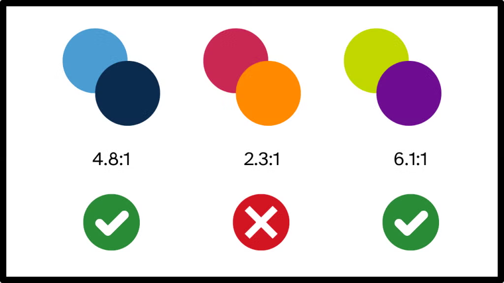
✔ Normal text requires a 4.5:1 contrast ratio – This applies to standard body text, which is generally considered to be smaller than 18pt regular font or 14pt bold. Maintaining this contrast ratio ensures that users with visual impairments can easily read the text against its background.
✔ Large text (18pt or 14pt bold) requires a 3:1 contrast ratio minimum – Because larger text is inherently easier to read, WCAG guidelines allow for a lower contrast ratio. This applies to headlines, large buttons, and call-to-action elements, which should still maintain clear visibility and legibility.
Understanding WCAG 2.2 Contrast Minimum
Color contrast refers to the luminance difference between foreground and background colors. Luminance measures the perceived brightness of a color, not its tone or hue.
🔗 WCAG 2.2 Understanding Contrast Minimum (opens in a new tab).
Measure It!
Want to ensure your text meets contrast standards? Use the TPGi Color Contrast Analyzer for accurate checks.
🔗 Download & Use the TPGi Color Contrast Analyzer (opens in a new tab).
Make Text Readable for All
Strong color contrast enhances content visibility and ensures readability for everyone. Accessibility is essential—not optional! Test your contrast today and create inclusive designs.
Keep the Conversation Going
How do you ensure accessible color contrast in your designs? Share your thoughts on LinkedIn and discuss best practices with fellow designers!
Author

Crystal Scott, CPWA
Web Accessibility Engineer